Final Panera logo design and essay

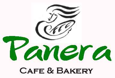
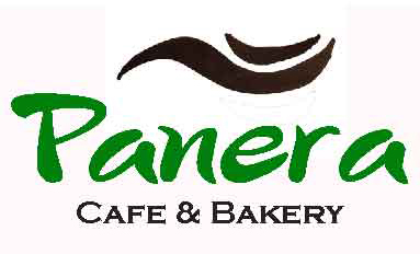
Here is my final logo:
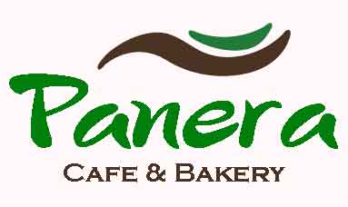
panero-logo-option-e

Here is Panera’s current logo:

panero-logo

How final logo visually communicates Panera brand

The new logo visually communicates Panera’s casual clean-green cafe and bakery brand in many ways – from the use of a new simple and casual visually appealing image, to the use of a their current (wonderful and recognizable) casual Panera font, to the use of contrasting complimentary natural warm and cool colors, to a name ‘rebrand’ that better reflects who they are.

Panera isn’t just a bakery.

How each of the logo design elements visually communicates the Panera brand is discussed below.

Design Rationale: 

The new Panera logo is simple, memorable, timeless, versatile, and appropriate.  How these design principles are incorporated into the new logo is integrated into the discussion below.

Inspiration – why Panera logo?, minimalism, shape, and color

The desire to redesign the Panera logo was inspired by my personal experience – I nearly didn’t try them (they came to our area several years ago), figuring they were a bread bakery.  I don’t each much bread.

Who knew they were a casual healthy food cafe and bakery?  If they hadn’t been in a hotel I was staying in near DC, I probably never would’ve found out.

They are now one of my favorite casual restaurants…

The overall minimalist look of the logo was inspired by Professor Groat’s lectures and several days spent reviewing other logos, including recent ‘best and worst’ lists and restaurant and healthy food logos.

The inspiration for the new image was six-fold :

  • Desire to improve on the current confusing, poorly rendered (IMO) image of ‘Mother Bread’
  • Mother Bread’s flowing hair in the current image
  • Desire to simplify the image a la the Nike ‘swoosh’ and make it readily identifiable and timeless
  • Images of ‘mother earth’ holding the earth in her outstretched hands
  • Desire for a natural color scheme and image representing Panera’s commitment to clean-green food
  • Desire to create a versatile, recognizable image that could be separated from the Panera name and used in a wide variety of ways

The image is intended to have two ‘deeper’meanings, both inspired by the Panera brand:

  • Mother Bread outstretching her arm, holding ‘green-clean’ healthy food, or conversely…
  • a spoon holding Panera’s clean-green food


Rule of thirds

The logo was designed following the rule of thirds, with the ‘image’ in the top third, the Panera name (large) and in the center, and their brand – cafe and bakery – in smaller letters in the bottom third.

Flow

The simple flowing image at the top is intended to draw your eye to the logo, then right down to the Panera name, which is presented in a large font for that purpose.  Then the eye is drawn down to the ‘cafe and bakery’ brand in smaller dark brown font.

Contrast

There is contrast in two primary areas – the attractive contrasting of warm and cool colors, and in the pairing of two very different fonts – one in the Panera name, and the second in their brand.

Repetition

The green font is repeated in the image and Panera name, and the brown font is repeated in the image and Cafe and Bakery font color.

Alignment

The text and images are centered horizontally and placed in an eye-pleasing way relative to each other.

Shape

The inspiration for the new logo image shape is discussed above.

The shape is intended to be simple, recognizable, timeless, versatile, visually appealing, abstract, and whimsical – reflecting the casual Panera font and their brand.

Name rebrand

The logo uses the name ‘Panera Café and Bakery’ – a rebranding of Panera Breads to better reflect what Panera is all about.

They don’t just bake bread…  they are a casual dining cafe restaurant bakery that is committed to using ‘clean and green’ ingredients and meat from animals raised ethically (think free range chickens fed with non-GMO grain, and antibiotic free cows)

I nearly didn’t try Panera because I am not much of a bread eater.

The name rebrand from Panera Bread to Panera Cafe and Bakery is one of the most critical logo change I made, and is intended to best reflect who they are.

Font

Panera name font:

I explored the fonts available on Adobe Illustrator by scrolling through them in the draft logo, and narrowed it to three plus the current logo, which is last:

My gut feeling was to identify a font that is a bit whimsical, script-like, and informal – in keeping with the casual nature of Panera.  I decided to stay with the current font – it is perfect IMO – it represents their casual brand perfect.  If it isn’t broken, don’t fix it.

Cafe and Bakery font – font pairing

I explored what the Panera font pairs nicely with, scrolling through available AI fonts.  I recalled the Copperplate Gothic Bold font I used on my Web banner – thinking it might be just right for the ‘Cafe & Bakery’ part of the logo.  It was – by far.

Color

Color simplification – less is more

The logo has been simplified from a color perspective – the green and tan background has been eliminated.

Two colors are used in the new logo – a brown that is currently in the ‘mother bread’ image is carried to the cafe and bakery font as also to part of the new logo intended to represent an outstretched arm (or spoon) holding food.

The green in the Panera name and in the logo image is intended to respresent their commitment to clean-green food.  The use of green in logos of organic and healthy food restaurants is common.

Digital variations of Panera logo including different fonts, colors, and a new image

For comparative purposes, here is the current Panera logo:

panero-logo

Here’s my first round of logos, which keep the Panera ‘mother bread’ image, but simplify the logo colors and rebrand the name:

panero-logo-option-1


panero-logo-option-2


panero-logo-option-3


And here’s the second round of logos, incorporating a newly designed (by me), simpler, abstract image of ‘mother bread’ inspired by her flowing hair in the current logo, the simplicity of the Nike logo, and a photo I saw on the internet of mother earth holding the earth.

This logo image is intended to represent mother bread’s outstretched arm holding Panera’s green and clean food, or alternatively, a spoon with food on it.

Different browns and fonts are also explored in these logos.

I have a favorite… let’s see what Professor Groat and the class think.

The first four explore different fonts for the Panera name:

panero-logo-option-epanero-logo-option-gpanero-logo-option-hpanero-logo-option-i

The rest of the logos explore different colors and a different image look:

panero-logo-option-fpanero-logo-option-dpanero-logo-option-cpanero-logo-option-bpanero-logo-option-a


6 Panera logo possibilities

The 6 Panera logo possibilities included in this blog have been rendered in Adobe Illustrator and Photoshop, two incorporating a hand-drawn image.

I may add additional hand drawn logo images to replace ‘mother earth’ as inspiration strikes….

Current logo for reference

Here’s the current logo for reference.

See the previous blog for background information on this logo, Panera Breads, and why I am interested in redesigning it.

panero-logo

The first three logo possibilities use the current ‘mother bread’ drawing and Panera name font.  All three of these drafts are close to the current look, but ‘cleaner’ (less is more).

I would likely include something like this in a sales pitch to Panera, figuring that they (and their customers) may be ready to make their current image more contemporary and relevant, but not stray too far from their original concept.

Logo name change – rebranding

The draft logos all use the name ‘Panera Café and Bakery’ – a rebranding of Panera Breads to better reflect what Panera is all about.

They don’t just bake bread…

This is one of the most critical logo changes I will make.

Color simplification – less is more

The first three logo drafts have been simplified from a color perspective – one color is used – the dark brown that is currently in ‘mother bread’ is carried to the font, and the green and tan background is eliminated.

First three logo drafts… similar to current logo, but cleaner and more contemporary look

The first one places the image at the top over the name a la the current logo, but it is larger, and placed to follow the swooping Panera font lines:

panero-logo-option-1

Second draft… Panera on top:

panero-logo-option-2

Panera on top with image and ‘cafe & bakery’ sized same width:

panero-logo-option-3

Green color option…

I am considering using green throughout the logo to reflect Panera’s commitment to using healthy ‘clean’ ingredients.  It is common to use green in healthy restaurant logos.

A fourth logo that has Panera in green text has been rendered in Adobe Illustrator using shareware for the Panera font.  Here ’tis…

panero-logo-option-1

Frustration strikes…

So far I have not figured out how to convert the ‘mother bread’ image from dark brown to green in adobe illustrator despite having searched the internet for nearly an hour. This seems like it ought to be a basic AI skill and easy to find and learn.  No doubt it is.  Will ask for assistance from Professor Groat.

Logo font exploration

So far I have not identified a font that I like better than the current Panera font.  I really like it.  It is available as shareware.  For now, I am using it in the new logo.

If it isn’t broken, don’t fix it.

Pairing fonts…

I have explored what the current Panera font pairs nicely with, and at this point am pleased with Copperplate Gothic Bold for the ‘Cafe & Bakery’ part of the logo.

I need to ID where to get the accent for the letter e…


New image explored – contemporary and minimalist

Here’s three images I sketched for the logo – intended to replace the current dated / poorly rendered ‘mother earth’ image, but all inspired by it … the top and bottom inspired by her flowing hair, and the middle by the loaf of bread.

hand-drawn-images

The top image looked too much like an eye with a beauty mark or a swimmer doing the front crawl, so I set it aside and sketched another one.

The middle image was intended to be a loaf of bread with something inside it (green, healthy), but I stalled and moved on.

The bottom image has possibilities IMO… it was inspired by the Nike swoosh logo, Panera’s Mother Bread flowing hair, and this graphic design of hands outstretched and gently holding the earth (found on an Internet search for inspiration of ‘mother earth’):

image

I decided to pull the bottom image into photoshop and explore it.  I quickly realized that if I moved the smaller curve to the top, it would look like an outstretched hand (mother bread?) holding something (food?), or perhaps a spoon holding food.  Or both…  all good for a cafe & bakery restaurant serving healthy clean food mother bread would be proud of.

So into the logo went the third design.

Or maybe I will be inspired to design a totally different image in the next few days…

I just noticed the three images taken together look like a face – eye, nose, and mouth.  Unintentional, funny, and cool.

Logos incorporating new minimalist image

The next two drafts go a step farther away from the current logo by rendering a more contemporary minimalist image – the one discussed above that was inspired by the current mother earth logo, a Mother Bread graphic art piece on the ‘net, and Nike’s simple swish logo.

So it is official:

The lazy S curve in the image represents mother bread’s outstretched arm, and her hand holding food in it.

The outstretched arm also happens to look like a spoon.

In one of the versions, the ‘food’ is in green, representing the healthy-clean aspect of Panera’s ingredients.

This hand-drawn image will be redrawn in AI if selected.

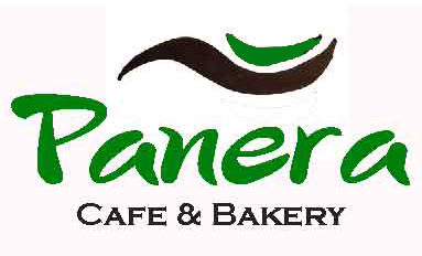
panero-logo-option-4

Second version with ‘food’ in mother earth’s outstretched hand in green:

panero-logo-option-5

My resident artist daughter prefers this last design, and has suggested replacing the very dark brown font with a mid-tone brown to move closer to skin color.  I plan to explore this idea.

Logo redesign choice: Panera Bread

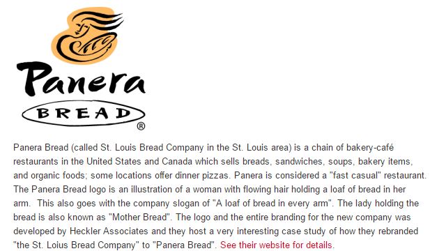
I have chosen Panera Bread’s logo for a redesign.  Here is their current logo in several forms, followed by some background information on the company and the logo:

panero-logo-samples-how-it-is-used


panera-logo-meaning-and-history

Here is a link to additional information Heckler Associates posted on the internet on the logo and brand:

http://hecklerassociates.com/brand-stories/panera/


Here is a link to Panera’s website.  Click the ‘our beliefs’ button to learn what is important to them… it is about healthy ‘clean ingredients’ – really healthful food you can ‘feel good about eating’, grown and raised in an ethical and healthy way.

https://www.panerabread.com/en-us/home.html


Why redesign Panera’s logo?

  • Because the name is confusing – Panera Bread is much more than a bread bakery; it is a fast casual café-bakery restaurant serving food made from healthful ‘clean’ ingredients grown and raised in an ethical and healthy way


  • Because the logo is artistically unclear – I didn’t realize the woman was holding a loaf of bread until I researched it. I used to wonder what she was holding… a pizza maybe? A baby in swaddling?   Is the word café ‘hidden’ in the loaf of bread (maybe…)


  • Logo is dated


  • Logo art (mother bread… earth?) is not aesthetically pleasing


  • Because Panera is one of my favorite ‘fast food’ restaurants – I love their food!  I can get an awesome bowl of black bean or tomato soup with a great ‘hunk’ of sourdough bread right at their drive through!  Panera has great healthy tasty food.


  • Here is where it gets interesting:  I almost didn’t try Panera because I thought they were a bread bakery based upon their name.  I don’t eat much bread. And their local store is on the Vestal Parkway, which I avoid like the plague.  And it is part of a chain – I eat at local Ma and Pa’s most of the time – a conscious choice to support local businesses.  I was staying in a Hyatt Regency  near DC last year, and there was a Panera Bread in the same building.  After having spent $25 for a mediocre buffet breakfast at the hotel, I decided to find another nearby place for breakfast.  This was the first place I spotted.  Imagine my surprise when I found out they had a full menu of really great tasting healthy food!


Web banner essay

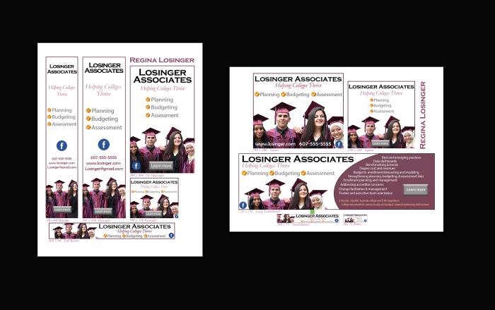
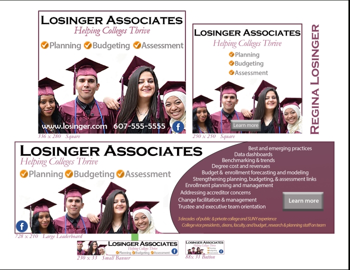
web-banner-compilation-final-version

Creative process – how I arrived at final visual look, identity, and brand

What sparked it…

The creative process for these web banners began with my plans to establish a professional consulting firm to provide planning, budgeting, and assessment services to colleges.

I am a recently retired SUNY Broome Community College vice president.  With 2 colleges a day (on the average) closing in the USA, the need for these services is critical.  Many colleges are in survival mode, and all are hoping to thrive.

Initial visualizations of a web banner look…

I desired web banners with clean lines and a contemporary refined professional look, with a ‘positive’ message, lots of white space (less is more), and links to important info like websites, phone numbers, email, and Facebook.

I also desired a look that stood out from the crowd…  that would draw in interested college presidents, VPs, and Boards.

Firm name

I explored two concepts for the firm name:

One that clearly indicates the purpose of the firm, and one that indicates who the principal is (me), with an associated selling line.  I quickly learned it is common to have the name of the principal in the firm name – consider for instance Passero Associates (architect and engineering services) and Levene-Gouldin-Thompson (law firm).

Not wanting to pigeon hole the purpose of the firm in my firm name – it will no doubt morph over time, I decided to use my name like so many do.

A final decision will be made on the name of the firm as I get closer to establishing it, as several others are interested in joining me.

Selling line

I explored selling lines…

‘Helping colleges survive and thrive’ came to mind right away.  It was a bit cheesy, and something about it troubled me, and I couldn’t put my arms around it at first.  But I decided to go with it, and ponder it more.

Ultimately I decided to drop ‘survive’ from the selling line for three reasons – first, many colleges are not in survival mode, but might still desire my assistance to thrive, second, it is ‘scary’ – it might turn away potential clients, and third, as mentioned above, it is cheesy.

So the final selling line is simple:

Helping Colleges Thrive

Followed by a bulleted list of the areas my firm will be specializing in:

Planning, Budgeting, and Assessment.

KISS

Web banner inspiration…

Professor Groat asked us to search the internet for web banners that interested us.  I identified 15 cool looks and a few duds I included to point out my desire to avoid them (seriously: a gun site?), and asked him to teach us how to get the look.  He did…

Continued Internet search for a banner ‘look’…

I continued to search the internet for what other higher ed professional consulting firms are doing. Interestingly I didn’t find many, but I did find several large consulting firms with large staffs of retired and ex college leaders.  This gave me pause to think about whether it makes sense to ‘go it’ on my own.  I will be thinking more about this before establishing my firm.

Most web banners I found did not inspire me – most were boiler plate business ‘looks’ that included photos of college buildings, men in business suits, graphs, financial reports, and even that featured a gun site

It troubled me that there were few students in what I found…

‘What happened to a student centered learning environment?’ I wondered…

I broadened my internet search to a more generic ‘college web banners’ to see if it might bring inspiration.  It did: I was nearly instantly inspired by the presence of students and graduates in college homepage banners.

Inspiration…

It hit me:  what better way is there to display colleges thriving than to show graduates or students actively learning?

I instantly envisioned a web banner featuring just a few graduates or students.  A diverse group representing our changing population was very important to me. A search of the internet for photos of graduates and students, with a few of my own student photos from SUNY Broome gave me at least five options to explore.

Development of draft web banners

I designed 5 very different web banner looks over a few days, each featuring a different photo of graduates and students, each with a different font and background look.  I asked for critiques from Professor Groat and fellow students.  They were all most attracted to one of the five banners, and preferred a version with a border.

Selection of ‘the look’ and refinement

I decided to go with draft banner that everyone preferred, and further refined the look based upon professor and student critiques.  I printed the drafts periodically and left them laying about, asked my artist daughter Ashlyn for her input, and set the project aside to go bicycling, hiking, and swimming.  Taking a break to do something physical often results in my greatest creative sparks.

Design and informational elements that visually unify web banners, reflecting a single brand and visual identity

The designs of the web banners are very closely linked, reflecting a single brand and visual identity:

  • Same group of graduates
  • Same colors : plum, gray, and gold
  • Same paired fonts
  • Same selling line : Helping Colleges Thrive
  • Same listing of services: planning, budgeting, and assessment
  • Same links : “learn more” button and Facebook link

How design concepts created a unified and balanced design in my favorite web banner

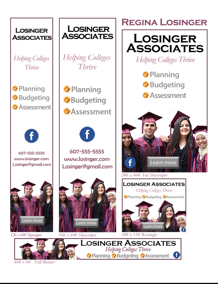
This is my favorite web banner.  Why?  The scale draws me in… it is visually appealing. It looks like a bookmark, something I like. I want to print it off and use it.  I can just picture it running down the right side of Facebook, the place I most often see web banners.  This web banner would catch my eye.  The web banners were designed with printing in mind too for higher ed publications like the Chronicle… they are all 300 pixels per inch.

web-banner-160-x-600-skyscraper-final

Emphasis

Positive: Colleges thriving – students graduating

Diversity

Purpose of firm – helping colleges thrive

Services provided by firm: planning, budgeting, assessment (note use of gold checkmarks to emphasize)

Contact info

Learning more

Balance

The graduate photo balances the (minimal) text

Lots of white space, making it visually appealing and easy to find what it is about

Rule of thirds balance – students in the bottom third of this banner; firm name and selling line in top third; services and contacts in middle third

Contrast

The use of three complimentary colors and paired fonts draw your eyes to different portions of the banner

  • Boldfaced black upper case Copperplate Gothic font for the firm name
  • Plum color Garamond italic font – the same color as the graduate regalia – for the selling line ‘helping colleges thrive’
  • Boldfaced gray Myriad Pro font for the services provided (highlighted with contrasting gold checkmarked circles); also used for ‘learn more’ button text
  • Boldfaced gray Berlin Sans FB used for contact info

Flow

The narrow banner draws your eye naturally from top down… with the bold firm name at the top drawing your eye there after a brief stop at the bottom to look at the graduates.

Alignment

All text and buttons are centered, with white space between firm name, selling line, services, and links

Repetition

Plum color of student regalia is repeated in the border, selling line, and contact info

A gold bullet check mark is in front of each service the firm provides

Gray is repeated in the ‘learn more’ button and services

Photo credit: 

The photo of the graduates used in every web banner is from Whatcom Community College. I found it on the internet using a google search on ‘college graduates’